

Sent my way by Jonathan, a designer at TriMet, who has this to say:
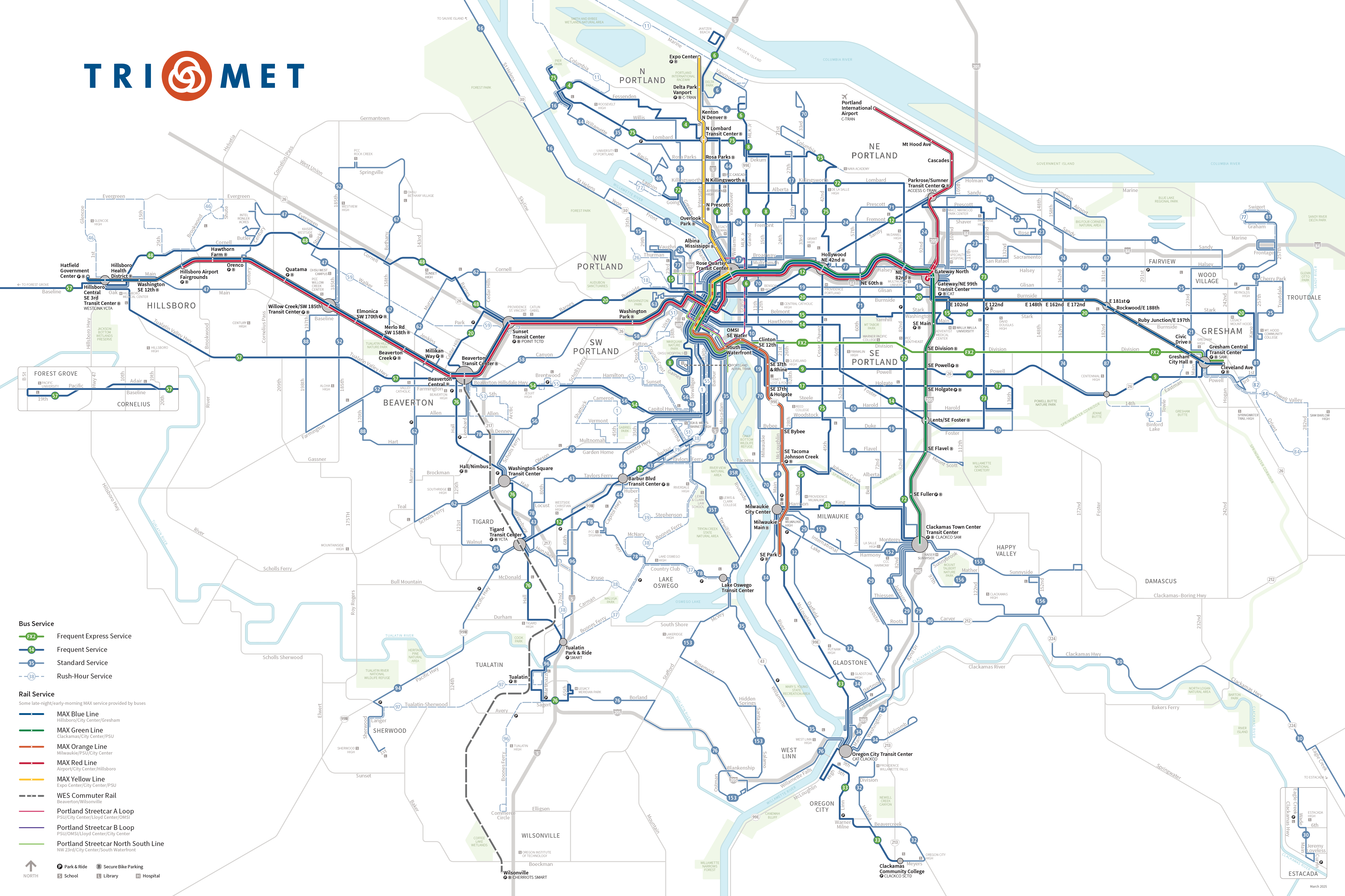
We just launched a couple new and improved maps: TriMet System and City Center. This was a long overdue update that brings those maps in line with the Rail System map that we’ve had for a few years. A few highlights:
- Bus lines, rail lines and streets have standardized angles, but still adhere (mostly) to geography
- Colors and symbols are standardized across all maps
- On the system map, service along the same streets is not combined into one line, which allows you to trace the routes easier, and also illustrates the breadth of service along corridors and destinations
- Parks and rivers are generalized so their fussy details do not distract
You can find the updated maps here.


Transit Maps says:
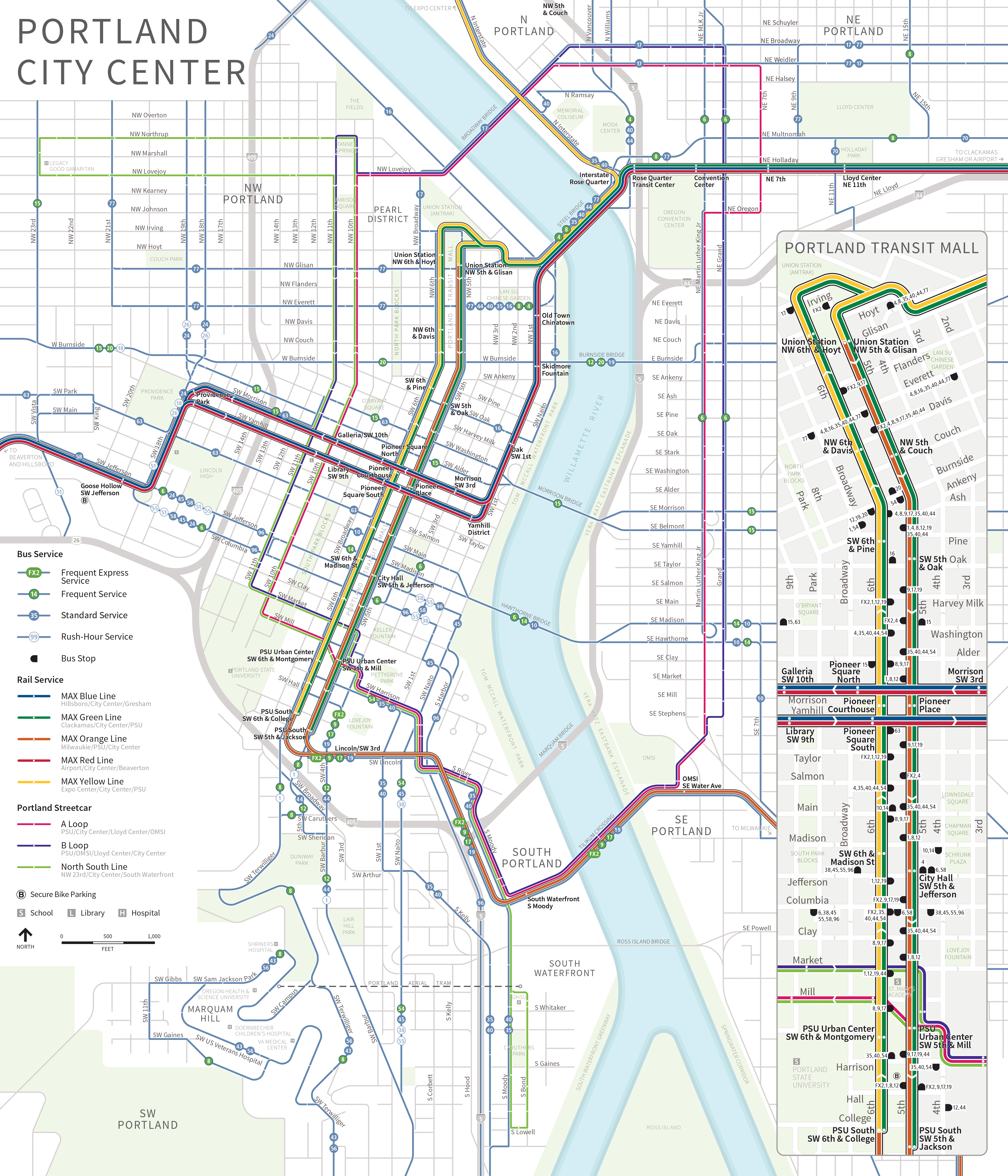
I’m going to concentrate on the overall system map on this review, though the new downtown/transit mall map is also worth a look if you want to head over to TriMet’s site to check it out.
TriMet’s previous geographical system map was pretty darn good – it differentiated the different frequencies of services well and was clear and easy to follow – so it’s interesting that a need was seen to update it. It does give all the maps a “house style”, and standardizing symbols, colours and typography across everything is very welcome.
I’ve always been of the mind that Portland’s rigid street grid almost eliminates the need for a diagrammatic approach to a system map, but I think that this new look is quite effective and uses the available space a little better. The “each route gets a line” approach generally works quite well, except in the downtown area and around the OHSU Hospital, where the routes seem to form a dense, indecipherable vortex. The old system map covered up the downtown area with a dark “Portland City Center” box, and I almost think that approach could have been used here… there’s a lot going on in a very small space!
I like the change of the Frequent Service route bullets to green. It differentiates them from Standard Service routes better than the old dark blue, and it matches the little green Frequent Service flags at bus stops as well. Nice! I do think an opportunity has been missed to properly define the service levels in the map’s legend. What exactly constitutes “frequent” service? In Portland, it’s 15 minutes or better, but it’d be nice to state that explicitly.
Other nice touches: the way that the MAX lines are lifted up “above” the rest of the map with a black outline, and the way that this black line also encloses the grey transit center circles… it’s a device that works well to draw attention to important interchange points without being too overwhelming or distracting.
I’ll be interested to see how some of the smaller grey labels reproduce when these are printed to go in bus shelters and on the back of ticket machines at MAX stations.
Our rating: A stylish update to a map that was already very competent. Three-and-a-half stars.
Source: TriMet website