

Submitted by Andrej Zografski, who says:
Our NGO Spasi Sofia/Save Sofia, (founded and run by five forum members of the SkyScraperCity) have designed and implemented new signs for Sofia metro. It is our free gift to the society we live in and input towards a better, more organized and welcoming Bulgarian capital. Now the first test stage is being implemented, and if it is successful in September we should put the new signs in the whole system.


For now we have made geographical maps of Sofia and the metro in the trains and a new type of signs for Sofia metro on Mladost 1 station (where you can transfer between the two lines). The signs are bilingual, have tourist information and make the Airport connection by metro very easy for foreigners.
We would love to hear from you, as foreigner which is not familiar with the city. We are now collecting opinions and critics, so we can improve our design. It will be very helpful and very much appreciated.
Best regards
Andrej and the team of Spasi Sofia
More info on our Facebook page or website.
Transit Maps says:
Over the years of running this blog, some of my favourite posts have been about these unofficial projects created by people who just want something better for the cities they live in. This map follows in the footsteps of Viteks Bariševs’ map of Riga, Latvia and Igor Skliarevsky’s wonderful map of Kiev, Ukraine, and is a worthy companion to both of them.
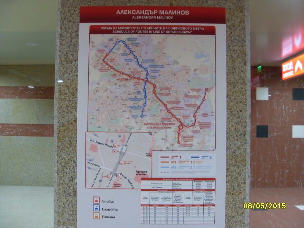
The new metro map itself is certainly much clearer than what’s currently being used, which confusingly shows both the line segments as they were constructed (Line 1 and Line 2 in bold colours) and the actual operating routes (M1 and M2 in lighter colours, almost unnoticeable against the busy background). It’s a bizarre decision and certainly not very user-friendly! The Save Sofia map wisely does away with the extraneous line segment information and simply presents the two “M” routes in thick, bold lines above a nicely simplified representation of the city. A gorgeous colour palette enhances the design further.
Interchanges, railroad stations, the main bus station, park-and-rides and the airport are all given clear, visually distinct icons which match the feel of the rest of the map nicely.
A legend underneath the map shows points of interest near three of the main Metro stations – with beautiful custom icons – but it’s a bit of a shame that these icons aren’t somehow cross-referenced on the actual map to allow for even better tourist orientation. This is the only problem I really have with the map, which is otherwise superb.
Even better is that the new Metro map is just a part of a suite of well-considered wayfinding signage – line maps for platforms and directional signage to guide travellers through the station. At present, the system is being tested in just one station, but I’m certainly hopeful that it will bring a positive reaction and wider adoption throughout the system.
Our rating: A labour of love, and it shows through in the end result. Simply lovely work that achieves all the goals that Andrej and his team set out to do. Four-and-a-half stars.