Submitted by Michael, who previously submitted this redesign of the current Pittsburgh rapid transit network. He’s since updated that map and I’ll share that soon, but he also sent along this intriguing fantasy map of Pittsburgh’s future, saying this:
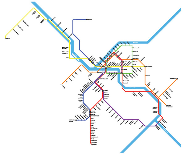
I have also created a Pittsburgh fantasy map. I have seen a few other fantasy maps, including this one, on which the red line crosses a river a meager five times, this one, in which most existing infrastructure is not even used, and this one, done by Ben Samson for a master’s thesis. However, I was ultimately unsatisfied with these proposals. Though I tended to agree most often with Samson and thought his was (understandably) the most well-planned, in creating this map, I had three things in mind, namely:
- Existing infrastructure should be used as much as possible, regardless of whether it is currently used for mass transit. To make my proposal more realistic than the first two, I preferred routes in which major roadways and railways already exist–and in which additional trackage could be created without much property acquisition/destruction.
- Connections which are not easily made in Pittsburgh’s existing infrastructure are preferred over those which are. For example, it is more difficult to drive from Duquesne to Emsworth than it is to drive from Duquesne to Aspinwall. Hence, the first is a one-seat ride and the second is not.
- Areas that are more dense (i.e. North Side, the East End, Bridgeville) have a wider variety of one-seat rides than those that are not (i.e. Brentwood, North Allegheny).
Additionally, having lived for some time in both Pittsburgh and New York, I think there a few things that Pittsburgh could learn from the MTA–even without building additional infrastructure.
- Routes that go through Downtown (incorporated into my fantasy map): Currently, both the East Busway buses and the West Busway buses terminate in Downtown. This means that they must turn around on Downtown’s tight streets, causing bus delays and traffic congestion. If the Port Authority were to configure East/West Busway buses so that buses originating along the East Busway were routed straight through downtown to finish their route along the West Busway, Port Authority could use half the number of route designations, provide more one-seat rides, and eliminate the delays and congestion generated by turning buses around in the more dense section of the city.
- Routes that share infrastructure (incorporated into my fantasy map): In New York, a person entering the subway at Forest Hills can take the E, F, M, or R trains. Once one enters Manhattan, these routes diverge, serving the World Trade Center, Coney Island, Middle Village, and Bay Ridge, respectively. Similarly, a rider who boards at Coney Island can choose four different lines which terminate in the Bronx, Astoria, and Jamaica. Running lines along the same route outside the city offers a greater variety of one-seat rides and, where one-seat rides are not available, encourages people to make transfers outside of the city rather than in its most dense areas.
- Delayed Express Trains (not incorporated into my fantasy map): On the Staten Island and Metro-North Railroads at rush hour, an express train leaves the terminal just a few minutes before a local train. The express train skips all of the stops until it reaches the half-way point in the line (in the case of the SIR, Great Kills), and then makes local stops to the end of the line. The local train, which doesn’t conflict with the express train, since it leaves a few minutes later, makes all stops up to the express train’s first stop–allowing for transfers between the first and second halves of the line. On trains such as the Red Line, where most passengers board in the same area (i.e. Downtown), Port Authority could implement a delayed express train using only two tracks which skips all of the stops between Station Square and Dormont, eventually terminating at South Hills Village–and another train which follows, making all stops to Dormont before heading back to Downtown. This would benefit people at the end of the line, as they would have a shorter ride, and it would benefit people closer to downtown, as fewer stops would be cut.
Express stops have not been added to the map, but I leave this as a exercise for the reader. In the comments, I challenge you to suggest which stops/routes would make the best express trains. As a starting point, I would suggest that some stops may be skipped on the 3 line on the West Busway and along the Allegheny River.
Transit Maps says:
It’s certainly interesting to read Michael’s comprehensive reasoning behind the map, although – as is often the case – the detailed ins and outs of fantasy maps can be a bit beyond a non-local like me, though I feel sure that native Pittsburghers will have some sort of opinion! It certainly looks plausible enough, and I like the idea of making the most of existing infrastructure.
What I can comment on is the way the map looks! Generally, the map is really nice – the slightly muted colour palette is unusual but effective, and somehow seems appropriate for the industrial Steel City. Perhaps the shade of blue used for the rivers is a little too tonally similar to the route lines, but the extra thickness counters this effect well enough.
The map obviously draws some visual cues from Vignelli’s New York subway map, but has an interesting quirk where route lines terminate upon meeting other perpendicular route lines. Instead of ending the route line as it meets the others, Michael chooses to continue the terminating line over the other routes, adding a station dot on the far side. I think it’s quite an effective visual device that draws attention to the terminating route in a nicely understated way.
Generally, the route lines are well drawn, with evenly-spaced stations throughout, although the lines to the northeast get a little too wiggly for my liking as they follow the river. A couple of routes are a little hard to follow as they pass under multiple parallel routes (the brown “10″ line in the downtown area, for example), but it’s nothing major. I often prefer to place the single route above multiple routes in cases like this, but it’s very much up to the designer’s personal preference.
One thing that I think is a definite no-no is the duplication of the “Rochester Road” station name on lines 7/9 to the northwest. I’ve checked on Google Maps, and there are Rochester Roads near both of the presumed station locations, but you simply cannot have the same station name twice on the same line less than ten stops apart!
A few errors that Michael may want to revise: the legend seems to be from his standard Pittsburgh map, as it references the busways, fare zones, and fare booths of the system, as well as indicating accessibility – none of these are featured on this fantasy version of the map. There’s also a rogue station dot at Station Square, and the angle change west of Sheraden station seems to be at 30 degrees, rather than the 45 degrees employed throughout the rest of the map. All very minor and easily fixed!
Our rating: An impressive piece of work that should engender much debate over its merits in Pittsburgh. It certainly looks the part! Three stars.
Like this:
Like Loading...


